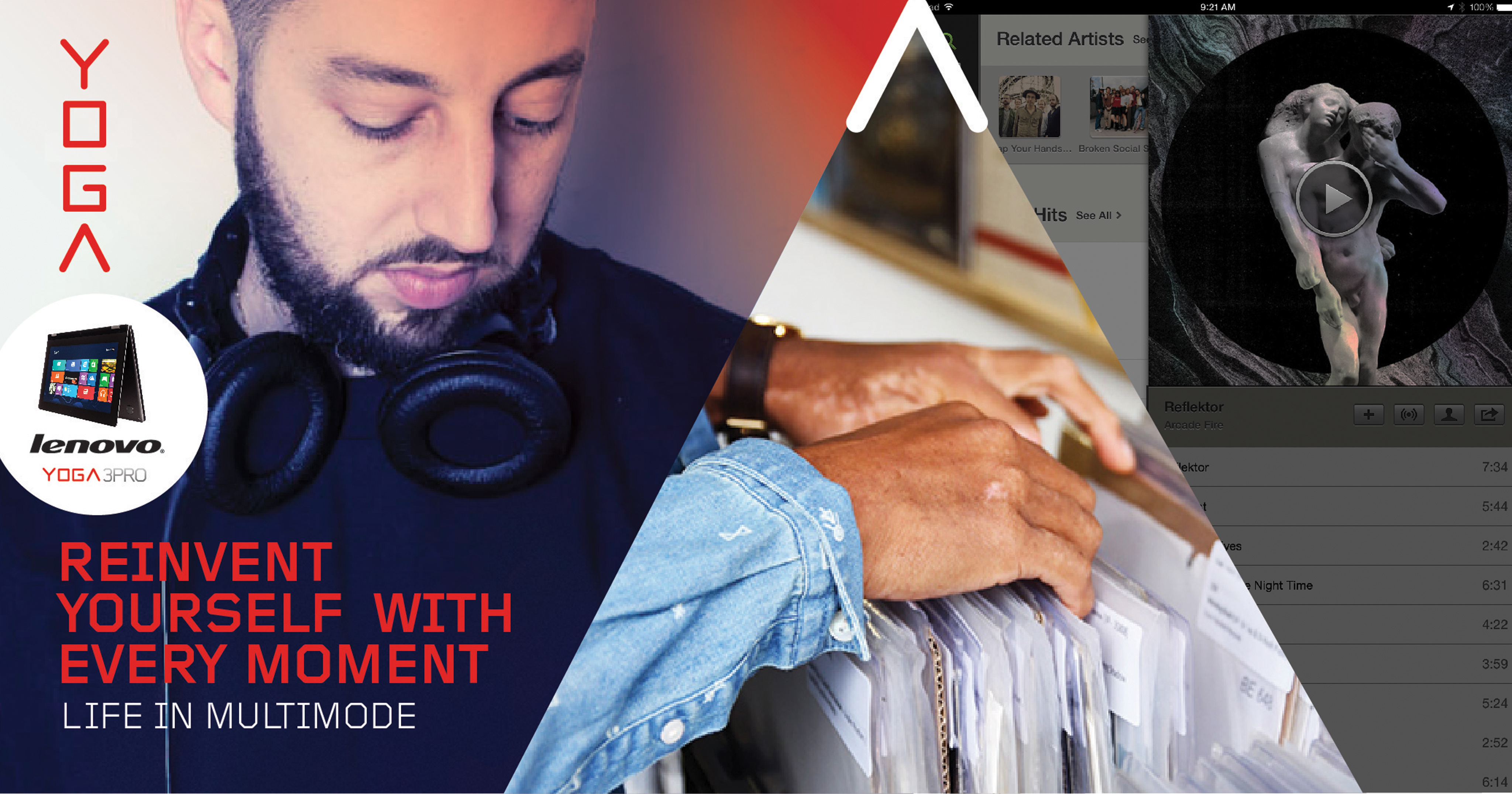
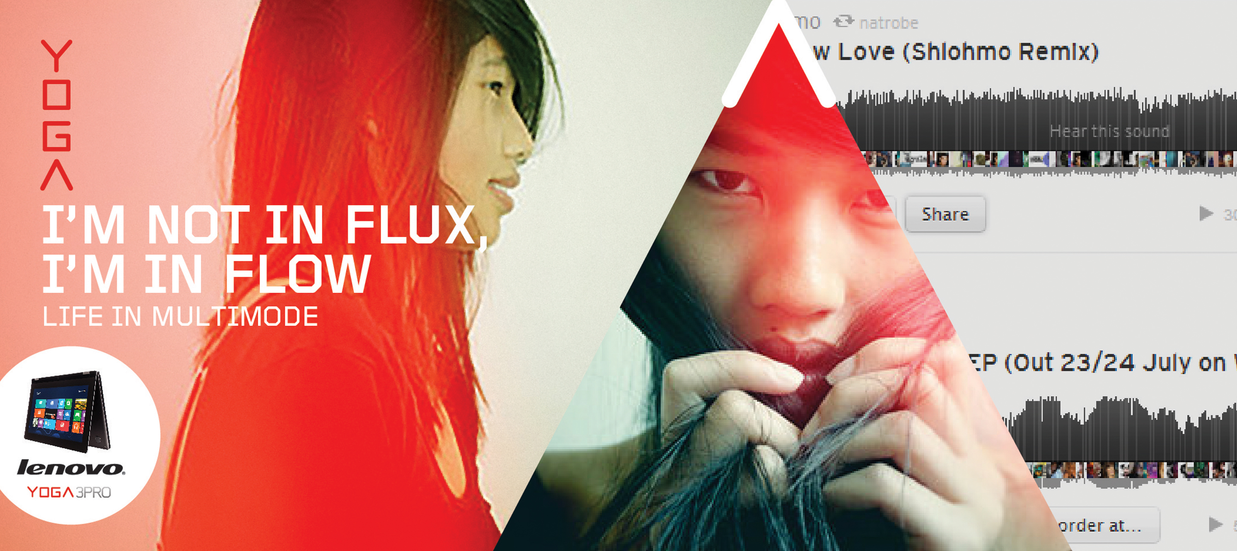
This Lenovo campaign parelleled the flexability of the product with the ‘flow’ mentality of a millenial culture. We wanted to celebrate instead of complain about the multi-tasking nature of a new generation.
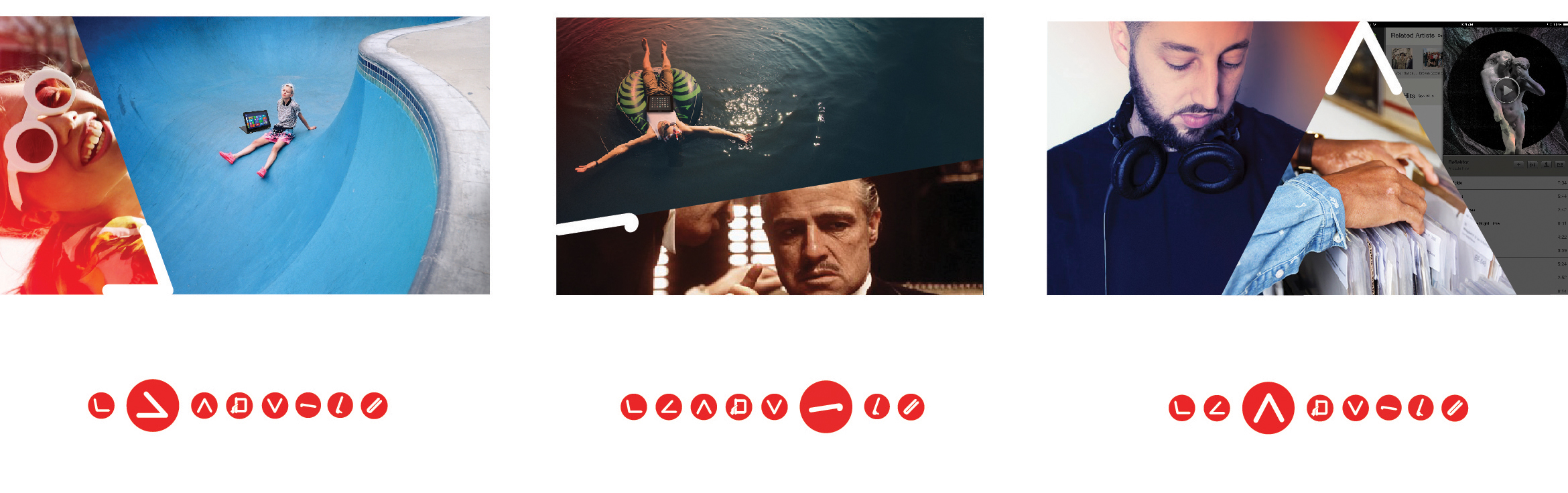
The communication was designed as a modular system; customizable and unconventional, in the spirit of the ‘Mutimode’ generation

The typographic treatment is inspired by both raw data entry and eastern symbolic languages. The stacking nature, celebrates basic computing and coding while sybolically paralleling it with the vertical orientation of pictoral languages, and texting culture. This forces the reader to digest the information in a controlled order. I wanted to challenge a typographic treatment familiar to online social platforms, in a traditional print format.
A circle detail acted as a violating element to the rest of the design. This helped to isolate and highlight the product from the lifestyle story. It also communicated a stamp of approval from the parent brand.